
When I was studying oil painting in college, my professor dropped this clever bit of wisdom on us,
"If you paint something weird, you'll simply have a weird painting.But if you paint 19 more of them, you'll have a portfolio."
Twelve years later, I'm shooting photos of landscapes, landscapes with buildings, landscapes with found objects, landscapes with fog, buildings with fog, reflections of a landscape in a window on a build--...WHY DID I STOP LISTENING TO THAT MAN??Because now I get the opportunity to hear Scott Kelby tell me the same thing:
Matt Kloskowski, Scott Kelby, and Pete Collins
[youtube https://www.youtube.com/watch?feature=player_detailpage&v=-QtVZxkeP7I#t=2308] (Forward to 38:28 to see the critique of my work)[pullquote]"Jason is a very good photographer"-- Scott Kelby[/pullquote]Even though the point of the episode was supposed to be "find that one bad photo and remove it", they went through it pretty well. After I got over the excitement and privilege of being a part of their first "Portfolio Intervention" episode, I paid attention to the bullet points:
"fog, fog, fog..."
Yeah, I like fog. :)
He likes the tub!
 I need to create a story for that darn thing... It's not mine, I just found it. But the pose and desert-like atmosphere brings a majestic sense of power to an otherwise ordinary feeding trough.
He likes "Tired"!
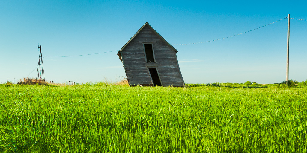 Come on, who doesn't like "Tired"? It's cute. :)
He didn't like "Fog 1"?
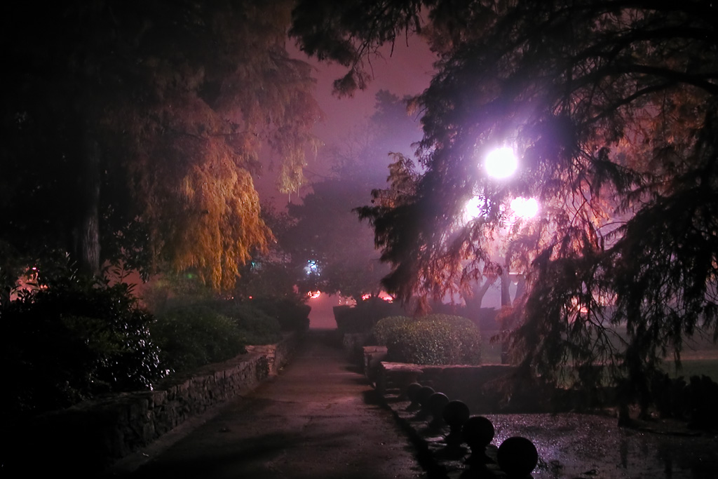 ...Yeah, I struggled with that one too. I took it in 2003, on the same night as "Fog 6".
- Fog 6 grew on me: it has a hook, the mood is less cluttered, and the layers of background elements are enigmatic of Chinese watercolor.
- The sidewalk in Fog 1 wants to be the dominant subject, but it just isn't. The texture of the trees is consistent all over, and there's no place to start. It just runs together. Still, I keep a framed copy in my booth because the purple tones attract attention. (Now that I think of it, Fog 1 looks much better in print than onscreen.)
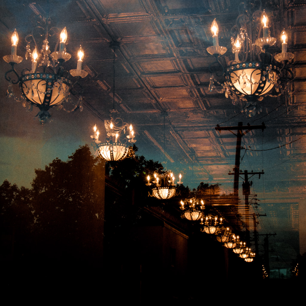
Oh yeah, "the window" lol
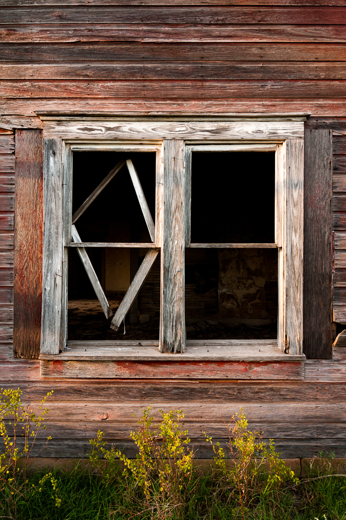
- That's my "keeping up with the Jonses" photo -- every photographer at an art festival has a window shot. It doesn't matter if they shoot flowers or astrophotography. Dig through their print bin long enough and you are guaranteed to find a window shot. (You're right, it doesn't belong in the main portfolio.)
"Restaurant? Or hotel lobby?"

- I agree this is an outlier. Most of my work deals with landscapes and rural artifacts, then BAM! This futuristic Blade Runner thing shows up. Then again, I find myself gravitating toward it because it's my latest (even newer than the Italy photos).
- This was taken looking through the side of the new addition to the Oklahoma State University Student Union:
 [pullquote]"You know what [the problem] is here?It's just kind of all over the place."-- Scott Kelby[/pullquote]
- Before this new section of the building was created last year, it was already the largest student union of any university in the world. Afraid somebody was going to catch up, they used $50 million to make it even bigger. For what it's worth, the building does include a large hotel, and an elaborate food court. :)
- Scott does have a point -- there's really no point of reference in that photo. Without a description posted next to it, it's just a bunch of lights.
- The only relation to "landscape" is the small area in the bottom half which contains a reflection of the sky. Thematically, this is my commercial work trying to sneak its way into my fine art collection.
The "fence" photo.
- Oh, boy. You just irked most of the population of northwest Oklahoma. Look in the background past that fence... That's the majestic Gloss Mountains you're ignoring!
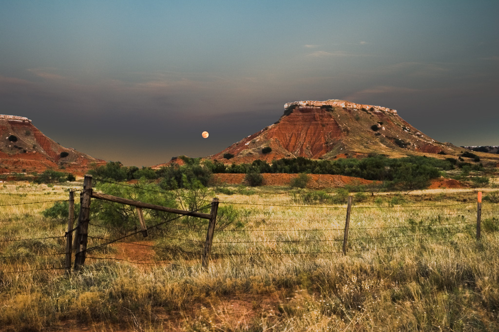
- This is my fourth most-popular print (behind "Union", "Tired", and "Monument Valley sunset"), but sales shouldn't determine my portfolio.
- That said, I can think of two negative criticisms against this:
- "Crappy light". My development process probably didn't help. Straight out of the camera, the sky was too bright and the ground was too dark. Lightroom didn't exist when I took it, and since I didn't know how to use layer masks at the time, I did the only thing I could think of -- an inverse curve. (I have far better development methods at my fingertips thanks to you guys at KelbyMedia!)


- Provincialism. Three guys in Florida probably don't find a set of rocks in the corner of this state all that interesting, no matter how loudly we call them "mountains". This place is only relevant to people who live within 200 miles of it. At only 150 feet tall, it's nowhere near as grand as anything in the proper Southwest (Arizona, New Mexico, Utah). It's the textbook definition of being too local, too provincial. If I'm trying to expand my landscape photography outside of the state, a large collection of this will hurt a lot more than it helps. (So I don't make a big deal about that photo when I do out-of-state shows.)
The Catch 22 of Provincialism vs. Descriptions
Story time: I used to have detailed descriptions next to each of my photos in my art booth. They were little signs cram packed with text: the title, the location (city, state, state park, etc), price, and even the GPS location for those really difficult to describe photos. Well, one day I decided to do the art festival in Norman, Oklahoma -- blissfully ignoring that it's the home of OU. (I am from Stillwater, the home of OSU.) Here's how several visitors reacted to my image locations:
- "Stillwater..Stillwater..Stillwater... Gah, it smells like Stillwater up in here!"
After three days, and I sold one print for $85.The problem with most of my work (especially "Moonrise" and "Fireballs") is that they don't stand alone -- they primarily appeal to viewers who are familiar with the locations in advance. If I try to educate people, I risk alienating them by describing how tight the geofence is around most of my work. Yes, most of my photos were taken within 200 miles of my house, and a cluster of those were taken within two miles. Even if the viewers are not totally offended by the location (my OSU shots will not only will scare off OU fans, but people who read Sports Illustrated), they still might not find the subject all that interesting compared to what they have in their own state.
Solution: Check da flava, fix the flow, narrow it down, open it up.
[pullquote]I live in Oklahoma, where shooting photos of "old stuff out in the yard"is like being on a tiny islandtaking beach shots.[/pullquote]I know I shoot everything. This is why I have so many galleries in my Purchase Prints section. But the main gallery has to be representative of an overall concept, not little pieces of every sub-gallery.My first order of business was to re-sort my portfolio to fix the flow. Start strong, cluster similar photos together, end strong, replace weaker photos with newer and stronger photos. (This is a technical fix.)Take more images for a wider audience -- shoot outside the geofence.Taking more shots of the most popular vistas in the country would address the provincial nature of my work. That was my intent with the new photos from Sorrento, Italy. But this will take time -- one set of photos from 7,000 miles away looks out of place when it's in a portfolio full of Oklahoma shots.But with shooting more recognizable subjects, I have to look at the bigger picture. Everybody is familiar with the likes of Monument Valley and Antelope Canyon, so how many other photographers shoot the southwest? I think the first photo on MattK's blog post can answer that.Besides, and you knew it was coming, so I'll go ahead and admit it: I'm one of those photographers who still has a day job (I'll let you guess which college campus). It cramps my travel plans, so trips to the likes of Italy are once a year at best.Find universal archetypes.The "Ashtub" seems really strong. It's got surrealism, 'object out of context', and nothing says it was taken in such-and-such place on a specific day. It's more about the tub, and less about the particular landscape.
- But if I go that route, I have to ask again: How many other photographers shoot similar subjects? Well, how do you think I got into it? I live in Oklahoma, where shooting photos of "old stuff out in the yard" is like being on a tiny island taking beach shots. Even worse than low-hanging fruit, it's already on the ground.
- How do I differentiate my work? Tweak the settings and technical minutiae of the camera? Print on different paper? Mat the paper differently in the matboard? (on it, *ahem..*)
Outliers?
- Even though "Fireballs" is an outlier in my current portfolio, it still works. "Power & Light" uses the same technique:
 I only have two photos in this "style". Lots of photographers probably take reflection photos through tinted windows, but how many of them focus their portfolio around it? Probably very few, and not any that I know of. There's a trick to this, and not all "photos through windows" work. I'm still digesting the recent critique, but when I reflect back on the "weird painting" analogy, I think I could use 18 more of these! The critique originally set out to remove the images that don't fit, but this strategy would expand my collection of outliers.Overall, I have to be consistent, and therefore predictable. Organize my portfolio so potential customers have a reasonable expectation of what my work is about, and what I will shoot next. It's an ongoing process.
How did I get on the show?
Follow Scott Kelby on Facebook or Google Plus. He will post a call for entries on the morning of the show -- either Tuesdays or Wednesdays at about 10:00am Eastern (9am Central). Follow his instructions, and hope for the best.Oh, and a massive thanks to Scott, Matt, Pete, and everybody else involved with Kelby Media. This is a massively helpful resource for me, and I recommend it to anyone remotely interested in photography.